
Turning a Desktop-Only Hiring Tool into a Modern, Responsive Experience
EthicalJobs.com.au
As Lead Designer, I led a full redesign of our most complex internal product - transforming an outdated recruiter dashboard into a modern, intuitive experience across desktop and mobile.
1. Problems
The recruiter dashboard - the core tool our customers used to assess candidates - was outdated, confusing and strictly desktop-only. Recruiters and hiring managers struggled with information overload, inconsistent UI patterns and an interface that had not evolved in years.
Our main competitor already offered a cleaner, mobile-friendly experience with essential features like intuitive sorting, filtering and message tracking. Our sales team reported that customers were increasingly reluctant to post high volumes of jobs because our tool felt clunky and inefficient, choosing competitors unless they wanted our ethical branding for specific job posts.
The product was becoming stagnant, and the business knew it.
2. Challenges
This was the most complex part of our ecosystem and highly visible to senior leadership. Redesigning wasn’t just about visuals - it required foundational change. Several factors made the redesign particularly difficult:
Legacy architecture: The dashboard was built years earlier, separated from the main site, and no longer aligned with current design or development standards.
Team turnover: The original developers had left, leaving behind outdated, inflexible code and components that were painful to maintain.
No mobile foundation: The UI was cluttered and never designed or built with the possibility of becoming responsive.
Heavy stakeholder involvement: Multiple department heads had competing expectations, making alignment critical.
3. Process
I started with user research, interviewing five recruiter clients. Using task-based scenarios, I observed their real workflows, identified friction points and validated which areas needed improvement first.
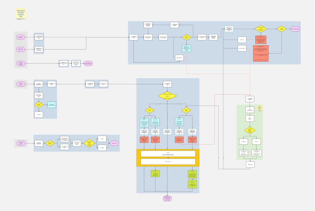
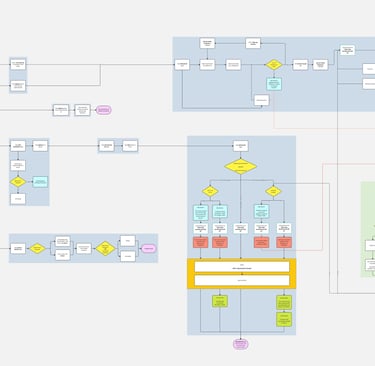
To align the organisation, I created detailed flowcharts mapping the entire end-to-end experience. This was a new practice I introduced for the product team and helped leadership and developers fully understand the scope and interdependencies of the redesign.
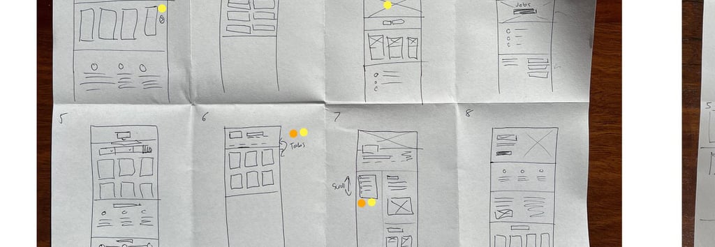
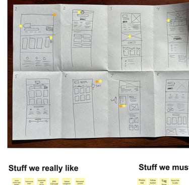
In Figma, I began with low-fidelity wireframes to explore solutions quickly and gather early technical input. Once feasibility was clear, I moved into high-fidelity prototypes, working closely with developers and management to refine interaction patterns and ensure the new experience could be built sustainably.
4. Solution
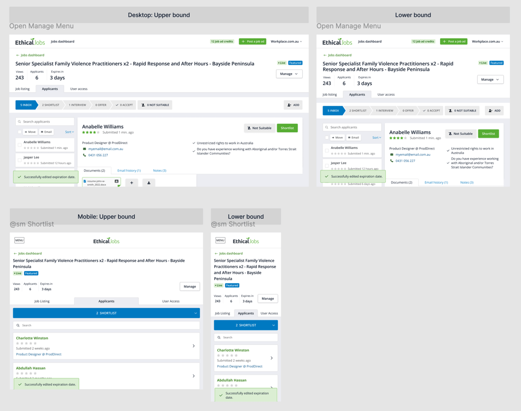
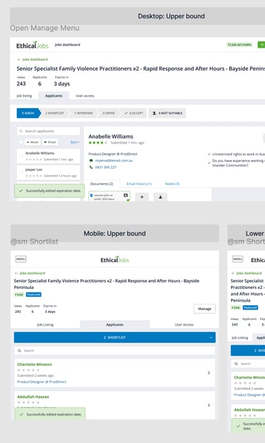
I proposed and received approval for a complete overhaul: a responsive interface designed from the beginning to be mobile-first which also translated into an improved desktop experience.
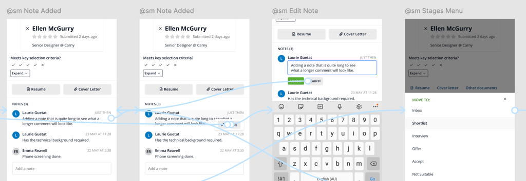
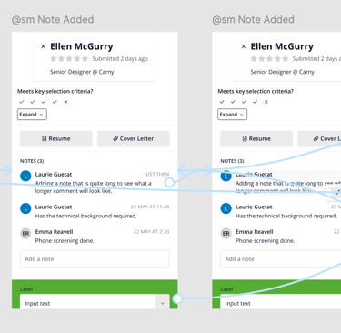
Behind the scenes, the largest effort was rebuilding the component library using my updated design system. This allowed developers to replace brittle legacy pieces with modern, modular components and finally bring consistency between the dashboard and the main site.
On the user side, recruiters gained a clean, intuitive interface that made sorting, reviewing and shortlisting candidates much faster. The new mobile experience welcomed our product into the fast-paced world of modern recruiting.
5. Impact
The work I led didn’t just modernise the dashboard - it solidified a new way of working between design, the rest of the product team and upper management.
Recruiter satisfaction: Sales and support reported overwhelmingly positive feedback. The key pain points - comparing candidates, sorting lists and managing messages - were resolved.
Mobile adoption: Analytics showed a steady rise from zero to a meaningful base of mobile users after launch. Despite limitations in tracking returning users, adoption was clearly steady.
Developer productivity: Engineers finally replaced outdated code with a modern, flexible component library, reducing maintenance overhead and enabling future improvements.
6. Reflection
This project reminded me that redesigning legacy tools is often more challenging - and more rewarding - than creating something new. Working within tight technical constraints strengthened my problem-solving and collaboration skills, and reinforced the importance of understanding both UX and code development realities.
The experience also highlighted a key truth: a simple request like “just make it work on phones” might sound simple, but can uncover deep architectural and design challenges. Navigating those layers, aligning stakeholders and guiding the solution end-to-end was as valuable as the design work itself.
Learnings
User engagement increased
We had positive feedback from our customer service team about the new responsive design. Recruiters were also finding it easier to understand the complex information belonging to each candidate, and particularly liked how intuitive it now was to shuffle each candidate between "recruitment states."
Responsive design should always be the norm
A key discussion centred on why the system hadn’t been designed for mobile in the first place. Historically, the assumption was that recruiters would only work on a desktop computer at their workplace.
However, mobile usage continues to grow, and the need to handle professional tasks on smartphones is often underestimated. It was not seriously considered, for example, that recruiters would want to browse candidates during their commutes.
This confirmed one of my early assumptions: just because someone works primarily behind a desk doesn't mean they will only ever use a desktop device. The reality is we now live in a mobile-first world.
PDFs don’t work well on mobile
PDF remains the standard format for CVs, but it doesn’t adapt well to small screens. Despite advances in responsive design, PDFs continue to pose usability challenges - an ongoing reality designers must proactively consider while designing interfaces. Ignoring how PDFs display is not an option.